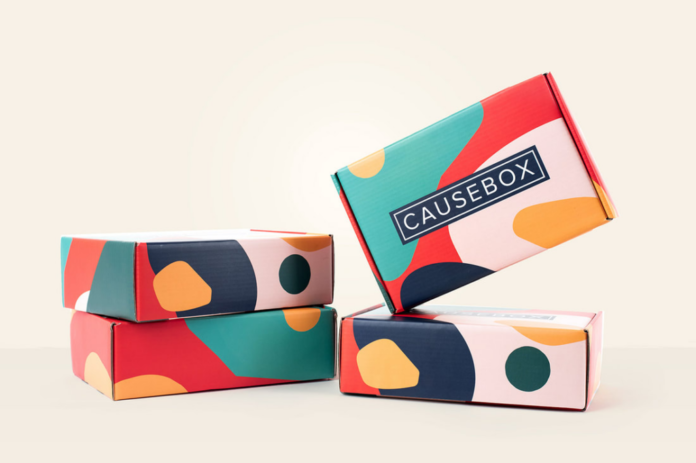
Strategic use of color can evoke emotions, communicate brand values, and even influence consumer behavior. How do you apply this to custom product packaging?
In the dynamic world of retail, product packaging serves as a powerful tool for capturing attention, conveying brand identity, and influencing purchasing decisions. Among the myriad elements that comprise effective packaging design, color reigns supreme.
In this guide, we’ll explore the art and science of leveraging color to create packaging that captivates consumers and drives sales.
Understand the Psychology of Color
Before diving into the intricacies of color selection, it’s essential to grasp the psychological impact that different hues can have on consumers.
Each color carries its own associations and triggers specific emotions, which can significantly influence how a product is perceived.
Key Associations:
- Red: Associated with energy, passion, and excitement, red can create a sense of urgency and stimulate appetite, making it ideal for food and beverage packaging.
- Blue: Symbolizing trust, reliability, and tranquility, blue is often used to convey professionalism and instill confidence, making it popular in healthcare and tech industries.
- Green: Evoking feelings of nature, growth, and freshness, green is frequently employed in eco-friendly and organic products, signaling sustainability and health.
- Yellow: Radiating warmth, optimism, and cheerfulness, yellow can grab attention and evoke a sense of happiness, making it suitable for products targeting children or promoting positivity.
- Black: Signifying sophistication, elegance, and luxury, black exudes a sense of prestige and exclusivity, often seen in high-end cosmetics and fashion brands. In printing, even the type of black is a consideration!
By aligning the chosen color palette with the desired brand image and target audience preferences, retailers can create packaging that resonates with consumers on a subconscious level, eliciting the desired emotional response.
Consider Cultural and Regional Preferences
In addition to individual psychological associations, it’s crucial to consider cultural and regional preferences when selecting colors for product packaging. What may be perceived positively in one culture could carry negative connotations in another, potentially alienating or offending consumers.
Cultural Significance:
- White: While associated with purity and simplicity in Western cultures, white can symbolize mourning or death in some Eastern cultures.
- Red: While often associated with luck and prosperity in Chinese culture, red may connote danger or caution in other contexts.
- Purple: Associated with royalty and luxury in many Western cultures, purple may be associated with mourning in some Latin American countries.
By conducting thorough research and understanding the cultural nuances of target markets, retailers can ensure that their packaging resonates positively with consumers and avoids cultural missteps.
Establish Brand Consistency
Consistency is key to building brand recognition and loyalty. When it comes to packaging design, maintaining a cohesive color scheme across product lines helps reinforce brand identity and create a unified brand experience for consumers.
Brand Cohesion Strategies:
- Brand Color Palette: Establish a signature color palette that reflects the brand’s personality and values, and consistently incorporate these colors across all packaging materials.
- Visual Elements: Use consistent design elements such as logos, typography, and imagery to create a cohesive brand identity that is instantly recognizable to consumers.
- Packaging Hierarchy: Maintain a consistent hierarchy of colors and design elements across product lines to ensure visual coherence and facilitate easy recognition on store shelves.
By adhering to a unified color scheme and design language, retailers can reinforce brand familiarity and make their products instantly identifiable amidst a sea of competing offerings.
Differentiate Through Contrast
While brand consistency is essential, it’s also crucial for products to stand out from competitors on store shelves. Strategic use of color contrast can help draw attention to specific elements of the packaging and create visual interest that piques consumer curiosity.
Contrast Techniques:
- Color Blocking: Use contrasting colors to create bold, eye-catching designs that instantly grab attention and differentiate products from competitors.
- Accent Colors: Introduce accent colors strategically to highlight key product features or calls to action, directing consumer focus and enhancing readability.
- Texture and Finish: Experiment with different textures and finishes, such as matte versus glossy or metallic accents, to create visual contrast and tactile interest.
By leveraging contrast effectively, retailers can create packaging that not only aligns with their brand identity but also stands out on crowded store shelves, increasing the likelihood of consumer engagement and purchase.
Test and Iterate
Effective packaging design is not a one-size-fits-all endeavor.
It requires ongoing testing, iteration, and refinement to ensure that the chosen color palette resonates with consumers and drives desired outcomes.
Testing Strategies:
- Focus Groups: Conduct focus groups or consumer surveys to gather feedback on different color options and gauge consumer preferences and perceptions.
- A/B Testing: Implement A/B testing with variations in color and design elements to assess which combinations resonate most effectively with target audiences.
- Point-of-Sale Testing: Test packaging designs in real-world retail environments to observe consumer reactions and measure the impact on sales performance.
By continuously monitoring and analyzing consumer responses to packaging design, retailers can refine their approach and optimize packaging to maximize its impact on consumer behavior and brand perception.
Conclusion
In the competitive landscape of retail, strategic use of color in product packaging can make the difference between capturing consumer attention and fading into the background.
By understanding the psychological associations of different colors, considering cultural nuances, maintaining brand consistency, leveraging contrast, and testing and iterating on design concepts, retailers can create packaging that not only reflects their brand identity but also resonates with target consumers and drives sales.
Mastering the palette is not just about aesthetics—it’s about leveraging color as a powerful tool to communicate brand values, evoke emotions, and ultimately influence purchasing decisions.
Talk to an experienced printer to make sure your colors come out perfectly the first time on your labels and packaging bags.
